
Iddera Life - Personal Health OS
Healthcare can feel overwhelming — especially digitally. Users arrive with questions, anxieties, and urgent needs, yet many health apps still feel transactional or cold.
My mission at Iddera is simply to make healthcare feel human, guided, and motivating - through intuitive design and well thoughtful communication.
Working closely with Product Managers, Engineers, Stakeholders, and Mangers, I have redesigned and designed several key experiences that improve clarity, trust, and everyday engagement in care.
Goal: Reduce friction. Increase confidence in care. Bring healthcare closer to real life.
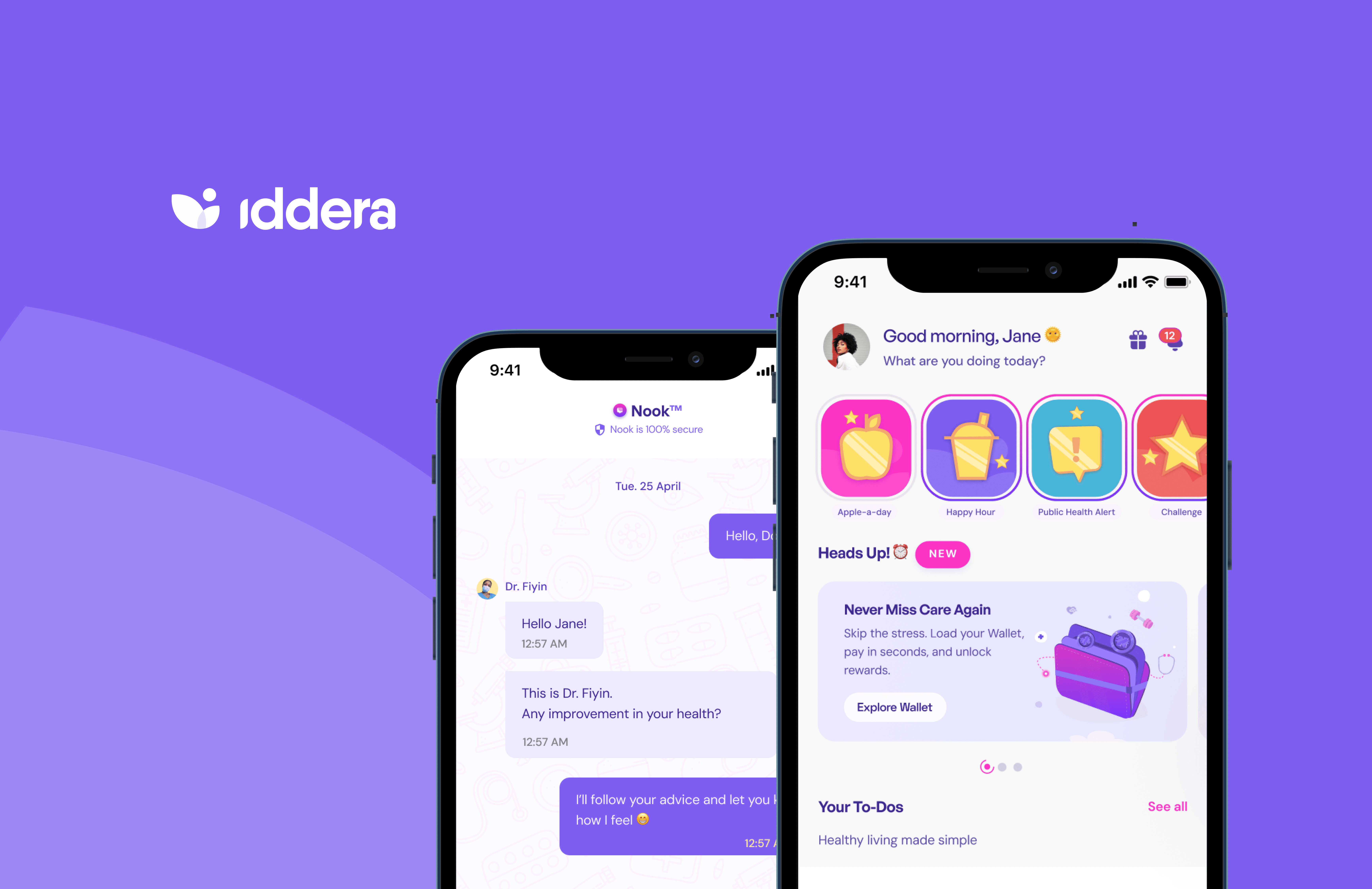
Telehealth Care
Challenge
Through strategy reviews, product audits, and user feedback, we uncovered consistent pain points:
1️⃣ Some users struggled to trust who they were talking to
2️⃣ They lacked understanding of their own health progress
3️⃣ Staying motivated felt like a chore
4️⃣ Care didn’t extend into everyday needs
5️⃣ Payments and financial access was needed
6️⃣ The growing app became harder to navigate
Design Objectives
Create a unified experience where users feel:
1️⃣ Connected to our trusted care professionals
2️⃣ Guided on what to do next
3️⃣ Motivated to stay healthy
4️⃣ Supported in everyday wellness
5️⃣ In control of their financial care decisions
6️⃣ Effortlessly able to find what they need
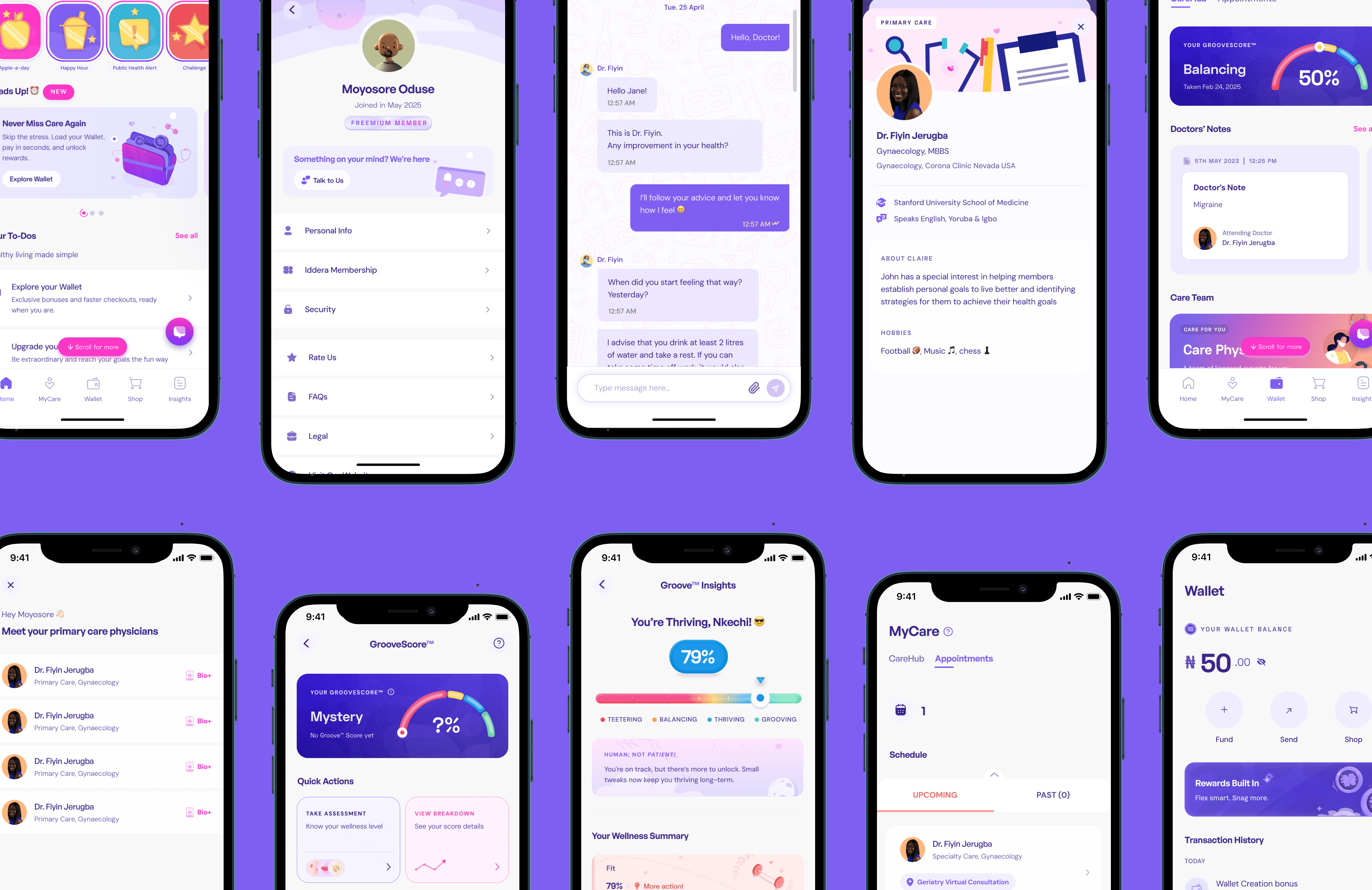
Key Contributions
Across multiple product verticals at Iddera, I led UX improvements that strengthened trust, clarity, and engagement in healthcare. Here are a few:
Humanized Consultations: Added doctor context such as avatars and bios to reduce anxiety and build connection before speaking with a professional.
Made Health Actionable: Designed a clear health scoring system with progress tracking and guidance toward care, helping users take informed next steps.
Motivated Everyday Wellness: Introduced a rewarding, lightweight points system that celebrates healthy actions and boosts engagement.
Enabled Care + Commerce: Designed a seamless shopping flow for health essentials, integrating browsing, bag, and purchase history into one experience.
Improved Healthcare Payments: Enhanced financial visibility and control with better wallet management, including funding, transfers, and withdrawals.
Redesigned the Home for Growth: Reorganized the main dashboard to prioritize care-first actions while supporting future feature expansion.
Process
1. Research & Discovery
Competitive analysis
Heuristic evaluation
User feedback synthesis
Stakeholder interviews (clinical & business teams)
2. Concept Exploration
Journey mapping
Wireframes & interactive prototypes
3. Collaboration
Consistent alignment with PMs
Weekly feature planning with engineering
Iterations based on team feedbacks
4. Validation
Internal usability reviews
Continuous testing as we scale
Impact
We’re seeing clear improvements in:
User trust during consultations
Understanding of wellbeing status
Engagement in app activities
Navigation confidence
But most importantly:
✨ Healthcare now feels more human.
What's Next
We’re still building - continuously refining based on real-world use.
The journey toward simpler, more empowering healthcare in Africa and beyond is ongoing, and I’m proud to help design it.